• Welcome to the ShrimperZone forums.
    You are currently viewing our boards as a guest which only gives you limited access.

    Existing Users:.
    Please log-in using your existing username and password. If you have any problems, please see below.

    New Users:
    Join our free community now and gain access to post topics, communicate privately with other members, respond to polls, upload content and access many other special features. Registration is fast, simple and free. Click here to join.

    Fans from other clubs
    We welcome and appreciate supporters from other clubs who wish to engage in sensible discussion. Please feel free to join as above but understand that this is a moderated site and those who cannot play nicely will be quickly removed.

    Assistance Required
    For help with the registration process or accessing your account, please send a note using the Contact us link in the footer, please include your account name. We can then provide you with a new password and verification to get you on the site.

New Crest Idea

I think the shrimp could do with some more work but otherwise that's not a bad effort at all.

Would you need to change your username though?
 
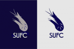
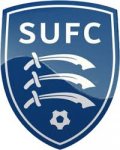
Seen a few teams rebrand there crest to a more modern style recently (ahem Leeds). So thought it would be fun to try and modernise the Southend United Crest.
I really liked the modernist style of the 70s crests, Leeds "smiley" for example and the classic Wednesday owl etc. I looked back to our 75ish Shrimp badge and thought I could give it a modern twist without losing touch with the clubs history.

Anyway thought id just put the feelers out and see what you guys think..

View attachment 6923

Looks like a logo for a sushi place.

I would like to see a pink manga style shrimp booting the ball towards the viewer with his or her tail.
 
Last edited:
Seen a few teams rebrand there crest to a more modern style recently (ahem Leeds). So thought it would be fun to try and modernise the Southend United Crest.
I really liked the modernist style of the 70s crests, Leeds "smiley" for example and the classic Wednesday owl etc. I looked back to our 75ish Shrimp badge and thought I could give it a modern twist without losing touch with the clubs history.

Anyway thought id just put the feelers out and see what you guys think..

View attachment 6923
I like the style, not keen on the shrimp. I think if you put the old '70s boot inside the circle instead of the shrimp it'd look great.
 
Isnt that the Jobson badge ? the one that he changed , note the lack of Shrimps , which he ditched for a Lion for some reason.
IIRC he then copyrighted it.

We had a change in the 70's , including this

View attachment 6932

The problem with the United badge is that it is not specific enough. There are several other united clubs and at least one airline and chocolate biscuit.

We could have another 'Southend' boot and a few swoosh lines to indicate the wearer is doing keepy uppies.
 
Sorry, but IMO, it looks crap.

A bit harsh in criticism, but i'm a bit of a traditionalist.

I'm still not over it when they changed the crest from blue and yellow

.
southendunitedprevious.jpg

What have lions got to do with Southend United?

Nothing. The badge is a joke.
 
Great idea @RetroBlue have posted up this to hopefully inspire you and give you some ideas.


Southend United Badge a Brief History

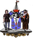
The first badge worn by the football club was the Borough coat of arms. This was used by the club from the 1950’s until replaced by an individual crest of their own.

The Coat of arms, first registered in January 1915, is a Blue shield with a silver pile. This is imposed on a gold anchor, a gold grid iron and underneath is a gold trefoil. The blue background is symbolic of the town’s coastal location. The gold anchor symbolises St.Clement (Leigh Church), the grid iron represents St.Lawrence (Eastwood) and the trefoil the Holy Trinity (Southchurch).Out of the silver pile rises a vase of lilies representing the Virgin Mary and the parish of Prittlewell. The shield is topped by a red mural crown and a ship’s mast flying the flag of St.George.

Supporting the crest on either side is a medieval fisherman holding a net and a Clinician monk holding a red book and a staff. The fisherman representing the traditional town industry and the Clinician monk emblematic of the Clinician Priory established within the town’s boundary since 1110 AD.

Underneath the crest is a scroll with the motto “Per Mare per ecclesiam” which translates as “By the sea and by the church”

arms-southend.jpg

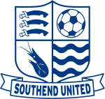
In 1968 the football club adopted its own shield. The design was a traditional shield separated into four quarters with different devices in each corner.

In the top left hand corner are the three curved seaxes on a red background representing the County of Essex. The top right hand corner is an old fashioned panelled leather football. The lower left corner is a silhouette of a shrimp, emblematic of the traditional town industry and also the clubs most enduring nickname “The Shrimpers”.

The nickname was certainly used in the clubs early years and a regular cartoon in the Southend Standard newspaper featured a bearded character called “Pa Shrimper”. The lower right corner contained three wavy blue lines symbolising the nearby River Thames and the town’s coastal heritage.

1970s-001.jpg

During the 1970’s the club adopted a second badge which was a football boot design with the word “United” incorporated in the boot shape.

southendunitedboot.jpg

In 1986 the club’s autocratic chairman, Vic Jobson, introduced a new club badge without any consultation with the supporters. He cited copyright problems with the traditional badge but in truth it was symptomatic of his bullish manner which despite on field success would drive an irreparable wedge between Jobson and the supporters.

southendunitedprevious.jpg

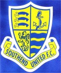
The shield colouration was changed to the “new” club colours of blue and yellow which had been adopted in the 1985-86 season when the club were sponsored by John Laing a building firm in which Jobson had a major interest.

The seaxes of Essex and the waves were retained but the football and the identifying symbol of the club, the shrimp, were cast aside. In its place was an anchor for some maritime symbolism. The major bone of contention was the shrimp being replaced by a meaningless lion rampant. No explanation was ever given for the presence of a lion.

The badge was replaced by an updated version for the 2000/1 season. The return to a modern incarnation of the original shrimp badge occurred in 2001 following a lengthy campaign by supporters. The old version of the badge had already been adopted by the reformed Southend United Supporters Club.

1200px-Southend_United.svg.png

Other badges used by Southend United

download.png

images.jpg
 
Some really great stuff here big daddy, I was definitely influenced by the 1975 shrimp one, although it looks quite tacky, I thought some modernisation had a lot of potential. Also influenced by the last round crest you posted really liked that! The light blue was added to reflect our recent away colours and thought it reenforced the ‘blues’. All in all I’m pretty happy with it but deffo open to some changes based on the historic badges you’ve posted.
 
I saw the thread title and thought it was going to be terrible but I actually quite like it
Thanks man, would be nice for the club to have some sort of rebrand, almost as a fresh start, our reputation as a yo-yo club is starting to drag and would be great to spark some new energy into the clubs image
 
Sorry, but IMO, it looks crap.

A bit harsh in criticism, but i'm a bit of a traditionalist.

I'm still not over it when they changed the crest from blue and yellow

.
southendunitedprevious.jpg
Call yourself a traditionalist? Yet have a love for a badge that was against our tradition? Interesting.
 
I would like to see the club crest feature someone in a Spall anorak listening to a transistor radio.
 
Back
Top